The Ask
REFRESH A CANADIAN ICON___
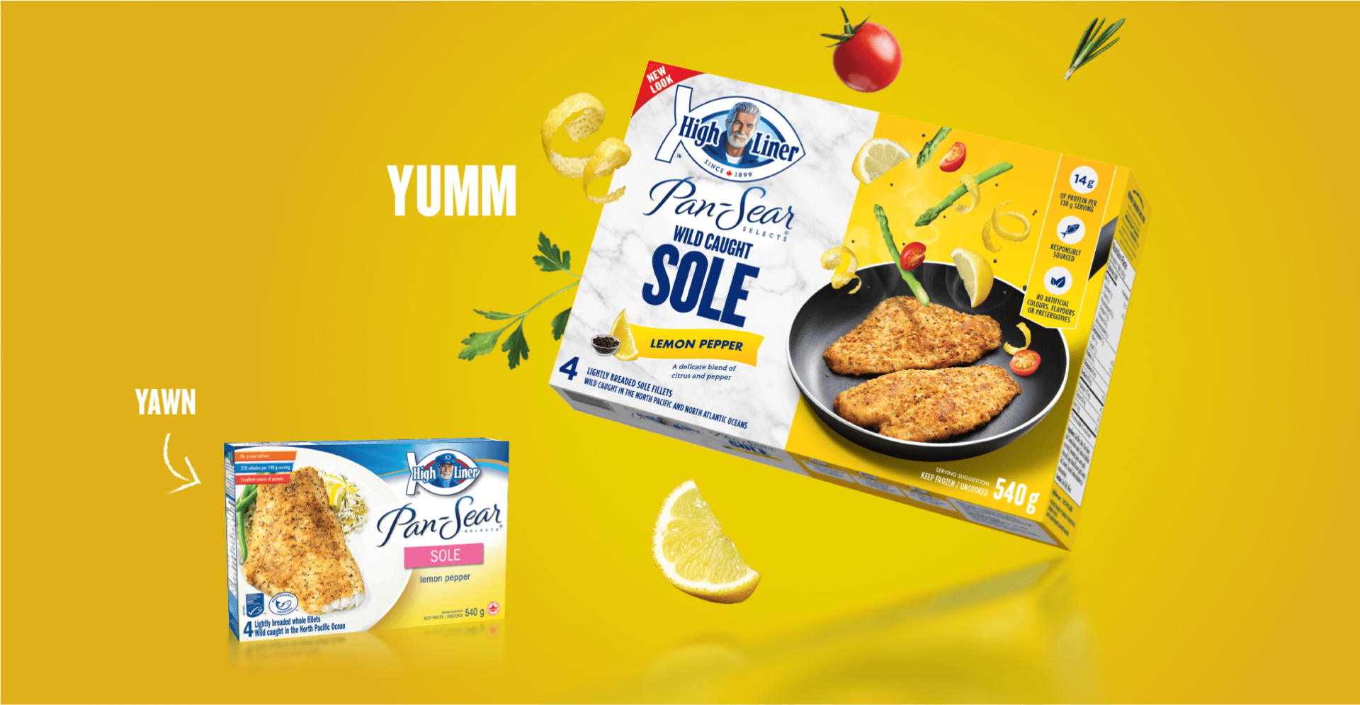
High Liner has always believed that seafood is better, but their brand positioning and visual identity no longer reflected their modern product line and intense passion for seafood. Everything was on the dinner table for consideration, including the brand’s most famous marketing asset, Captain High Liner. Heading into the company’s 120th anniversary, we were thrilled to spearhead a major brand refresh for High Liner, and find out if an old Captain could still learn some new tricks.
The Insights
CELEBRATE SEAFOOD___
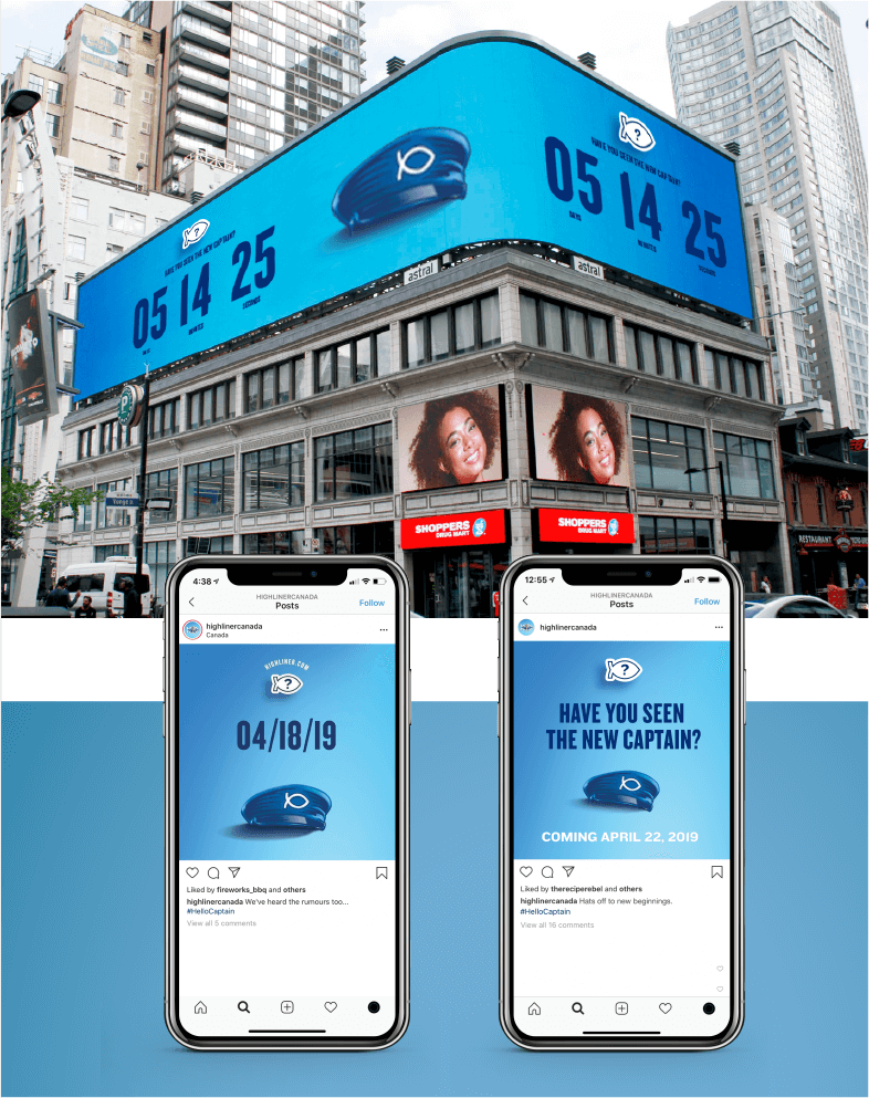
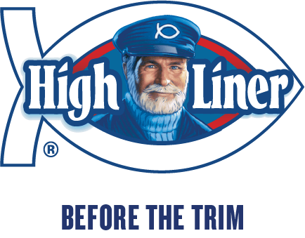
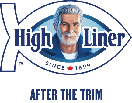
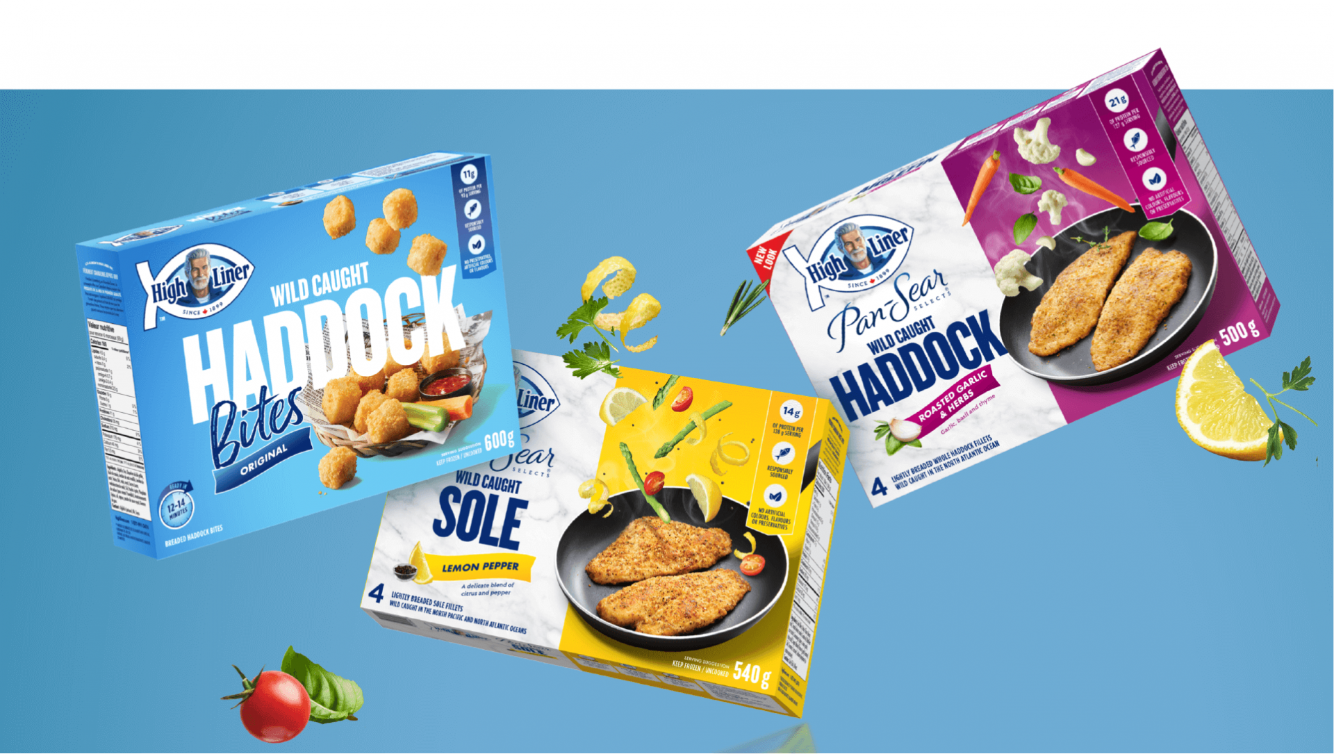
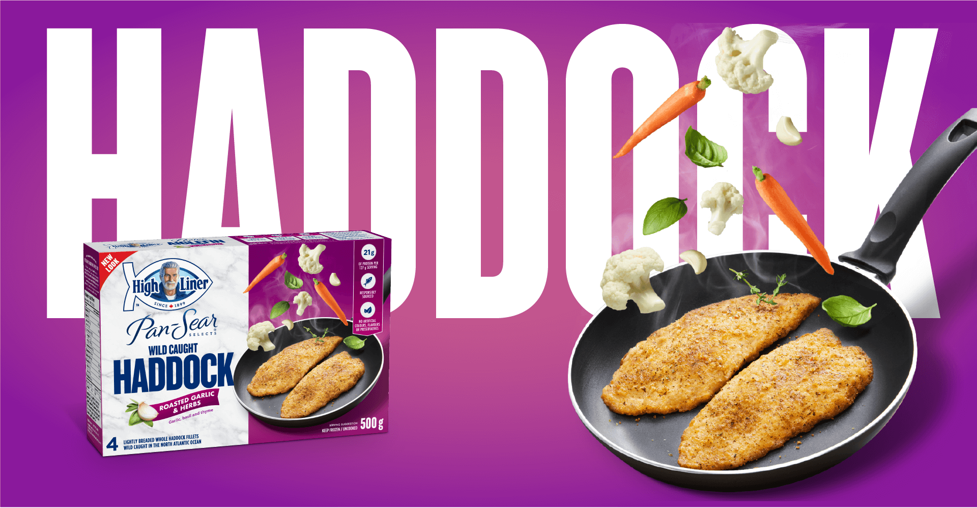
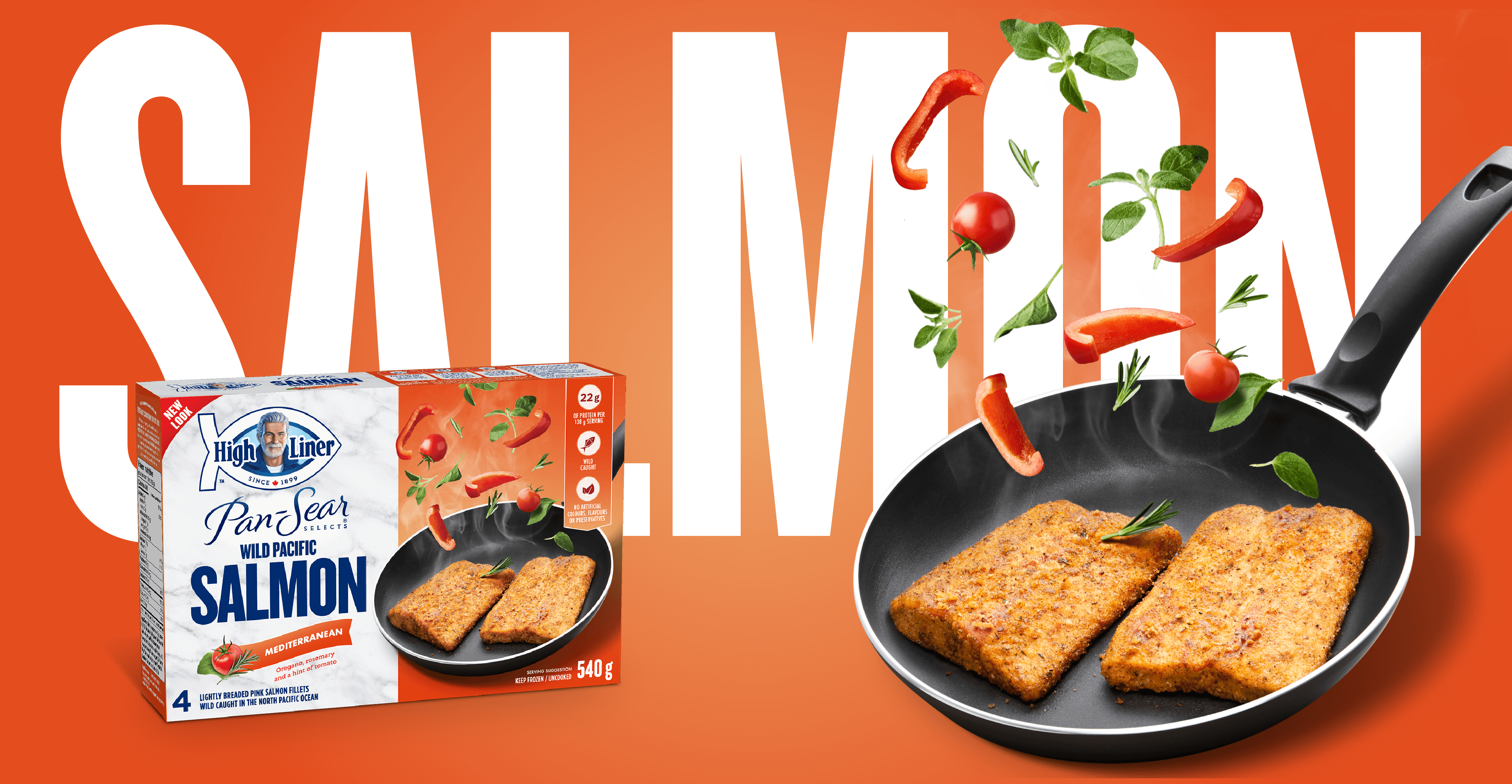
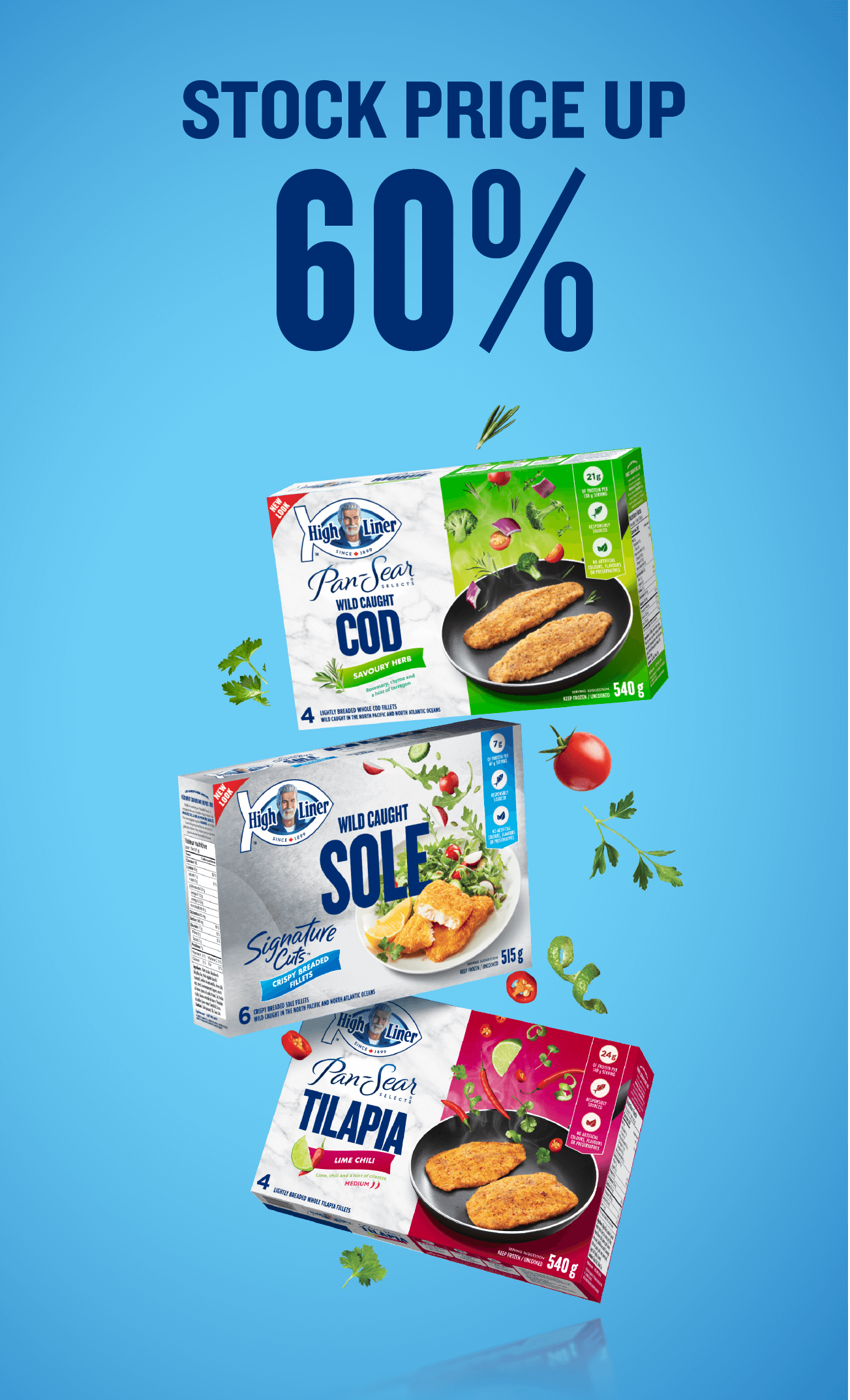
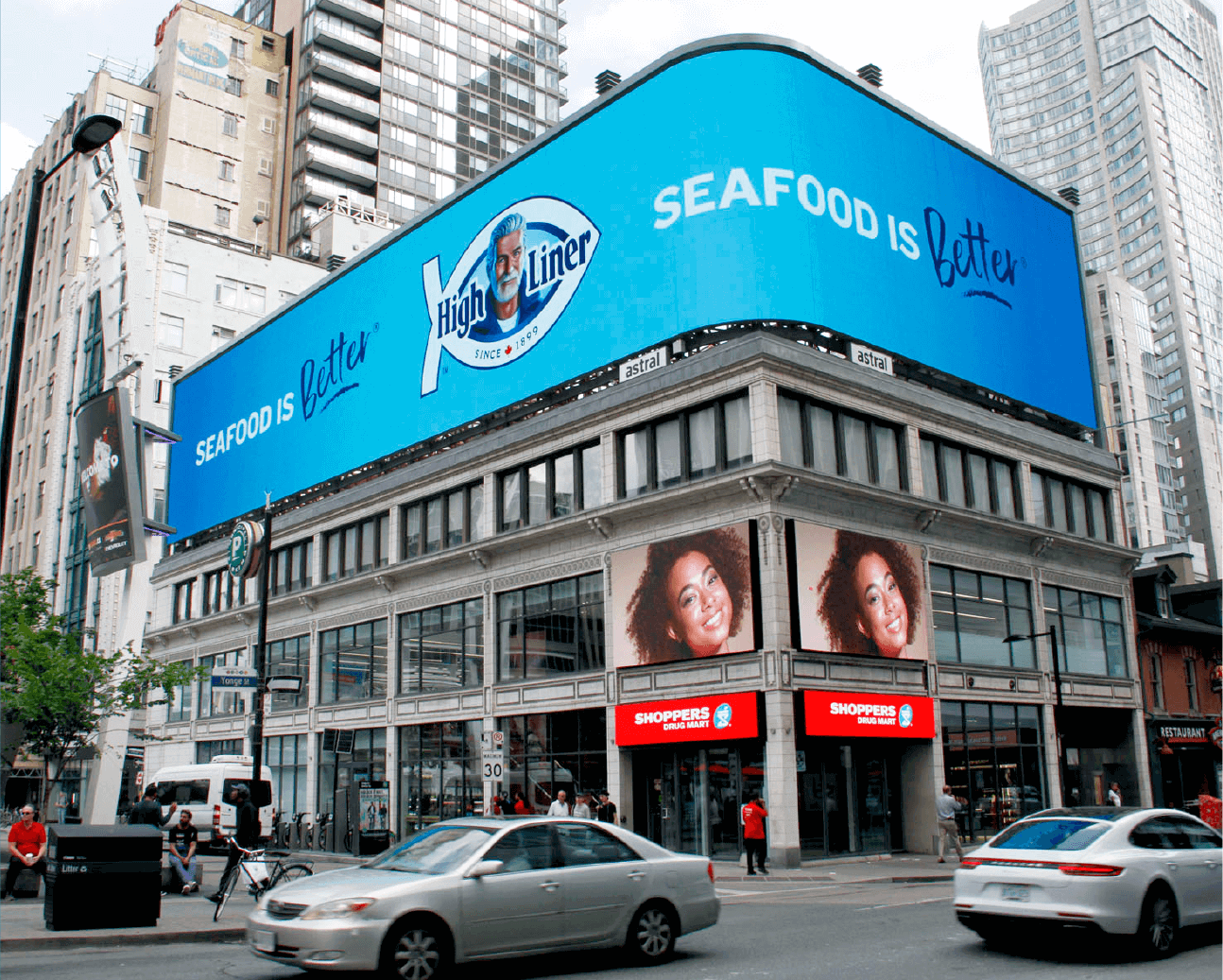
We positioned High Liner to champion and celebrate the incredible taste, versatility and role of seafood on Canadian plates. Along with a full suite of vibrant new packaging, we introduced Canadians to High Liner’s new Seafood is Better tagline with a fully-integrated marketing launch. And we gave Captain High Liner a head-turning update that better reflects the brand’s young-at-heart personality. #HelloCaptain, indeed.
The Insights
MAKING WAVES___
News of the brand refresh, and most notably the Captain’s makeover, took Canada by storm. His new look garnered the attention of CBC, Breakfast Television, HuffPost, and other news outlets, as well as several radio stations across Canada. He also caught a ton of buzz on social media, revealing our country’s enthusiastic investment in him. There were even some cheeky comments thrown into the mix – we can report that the Captain is totally flattered.
The Buzz
- Strategy
- Branding
- Packaging
- Digital
- Social
- Shopper
- Marketing
- PR
- Advertising
