The Ask
FRESHEN UP A STALE BREW___
Standing out in the booming Canadian beer industry isn’t easy. With so many new players entering the game, veteran Sleeman needed to put its stake in the ground and find a new way to be remarkable. And after months of failed attempts that left their rebrand dangerously behind schedule, they needed to do it FAST and RIGHT. So they called us.
The Insights
REFRESHING, INSIDE AND OUT___
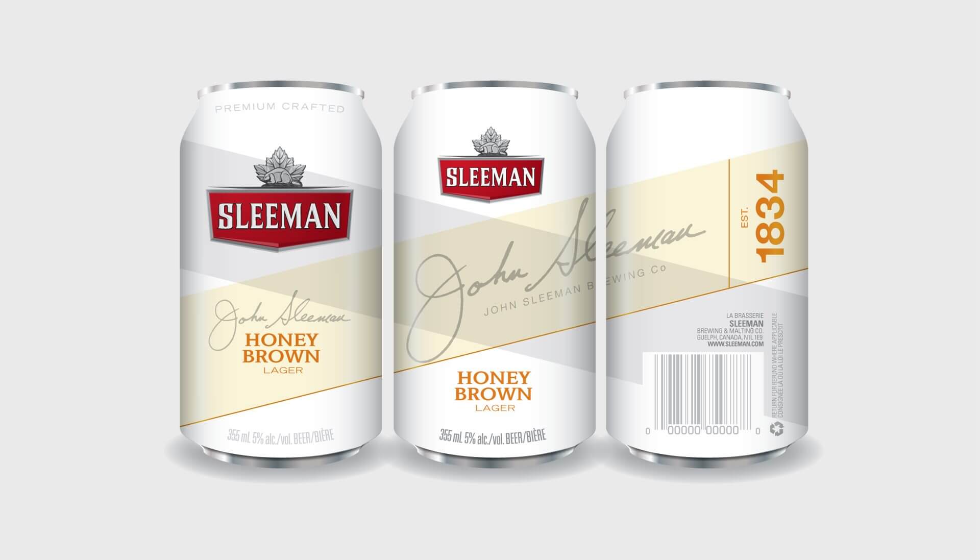
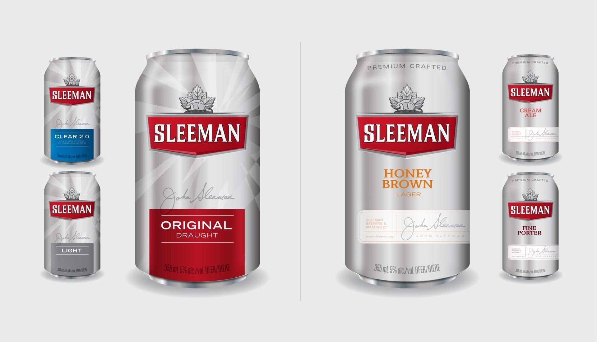
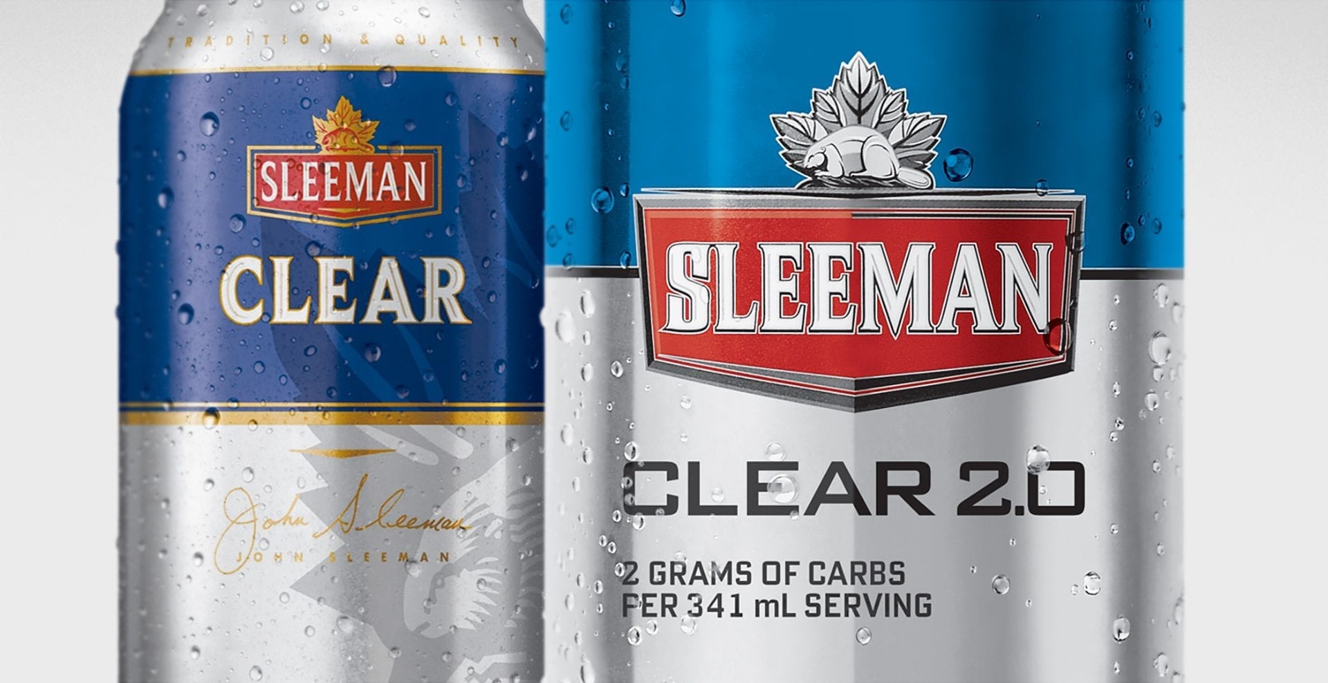
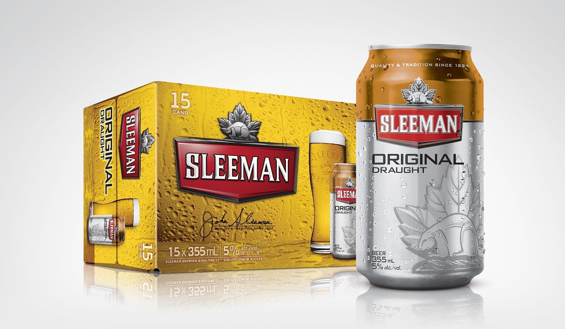
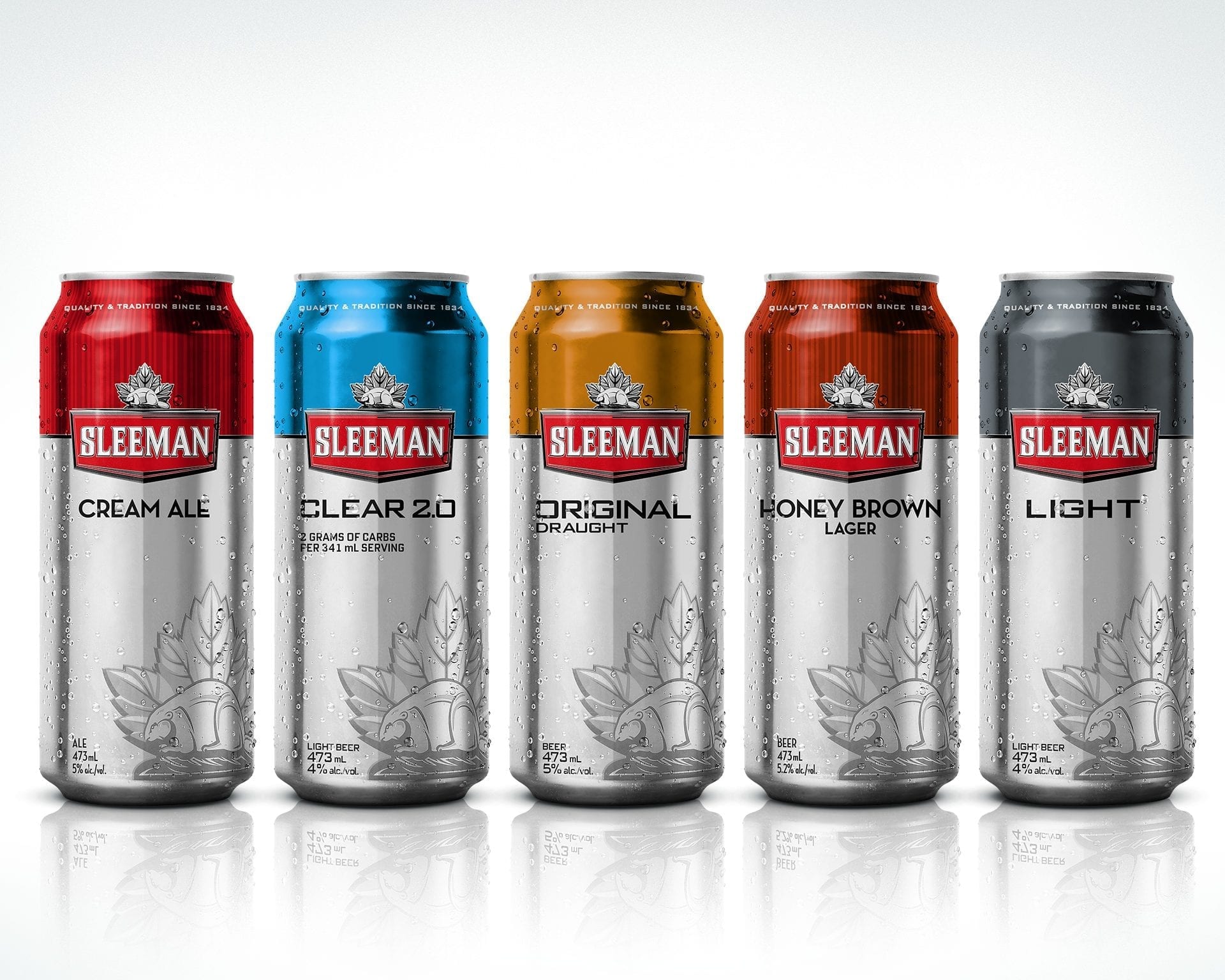
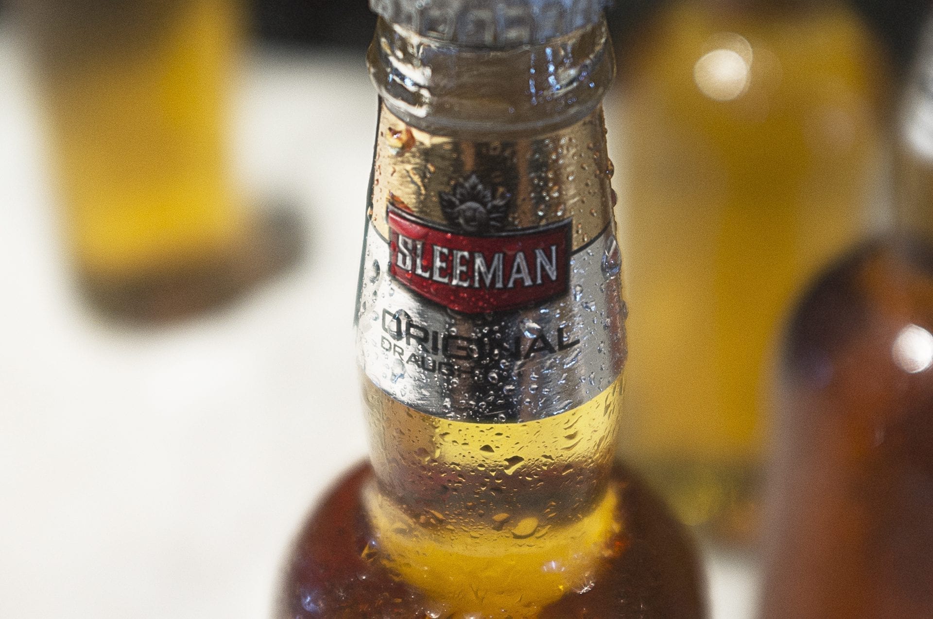
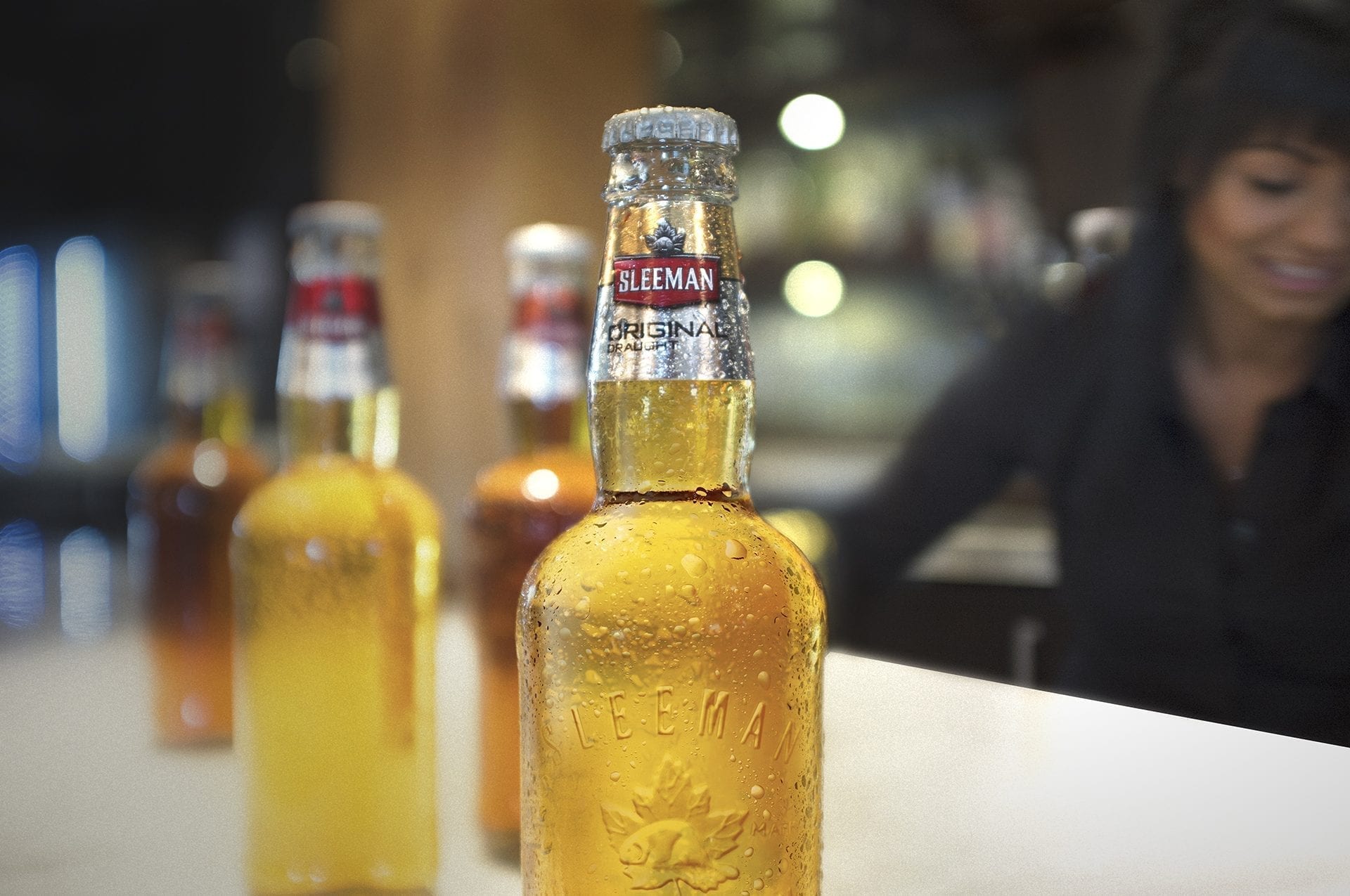
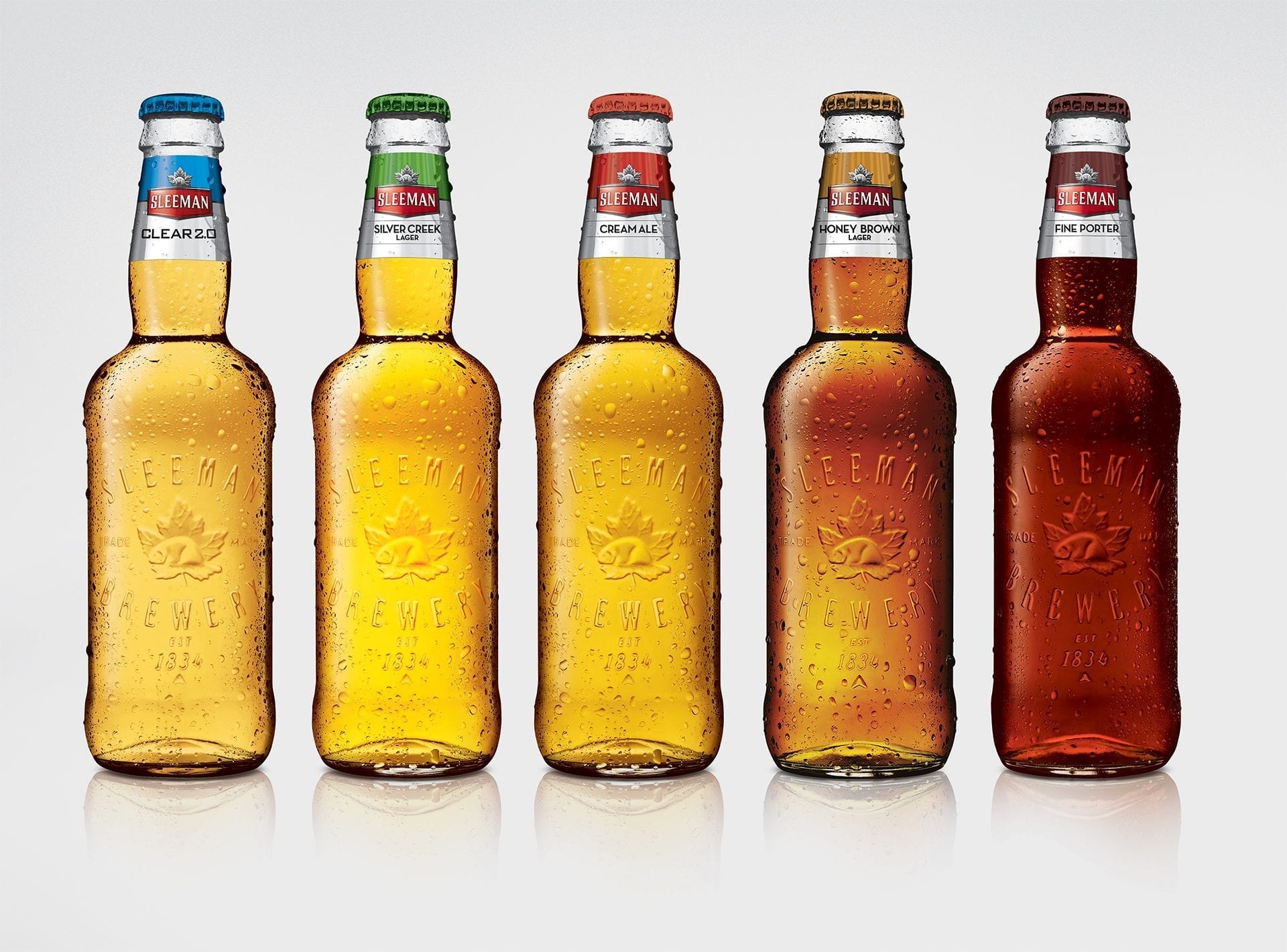
We focused on Sleeman’s strengths, creating 20 new packaging approaches based upon key brand insights. The new designs focused on taste and refreshment cues while helping to streamline the various flavour profiles of the brand’s beers. Our new designs were a visual toast to the Sleeman legacy of crisp, delicious and unpretentiously refreshing beer.
The Payoff
LET’S DRINK TO SUCCESS___
In just six weeks the Sleeman brand and sub-brand packaging was completely remastered, with a new look and feel that’s as refreshing on the outside as on the inside. Not only did we pull off a rapid turnaround that integrated brand heritage with a forward-thinking design, we also helped boost Sleeman’s market share in an otherwise flat category.
We Delivered
- Concept Development
- Package Design
- Masterbrand Architecture
- Package Rollouts
